
Mill City Farmers Market Kiosk
User Experience, User Interface, Wireframing, Kiosk Design
Team Members: Maggie Suino & Peyton Crombie
The Mill City Farmers Market kiosk is a resourceful kiosk located at the entrances of the popular Minneapolis farmers market. The informational kiosk serves as an asset for new comers or regular attendees to learn information about sellers, navigation, and activities to partake in while attending the market. The kiosk hopes to aid those who may feel uncomfortable partaking in the farmers market and help them develop a mission while attending. The kiosk was designed for all in mind with accessible big type sizes, distinct color contrast, and large buttons to tap.

Final prototype walk through

DESIGN PROCESS
1. DisCover
The Mill City Farmers Market is a farmers market located within the heart of Minneapolis, Minnesota. It is a non-profit organization that was established in 2006. The farmers market is a trusted source for healthy, local and sustainable groceries, combining a vibrant marketplace with nourishing community connection.
ABOUT THE MILL CITY Farmers Market
The mission of the farmers market is to inspire and nurture a healthy community by building a local, sustainable and organic food economy in a vibrant experiential marketplace.
Mission
The farmers market believes in the values of inclusion, stewardship, learning, leadership, partnership, and community.
VALUES

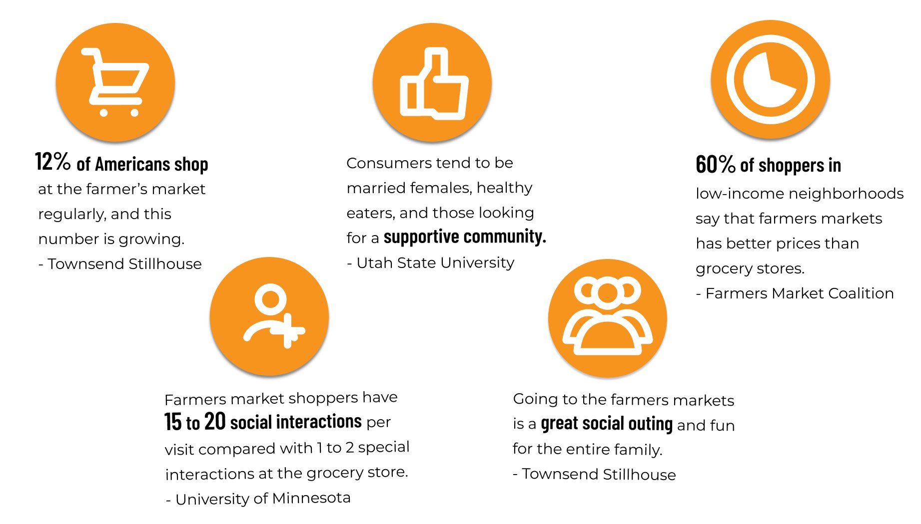
Market Research
Through research, it was found attending farmers markets are a beneficial addition to our everyday lives. They provide opportunities for all to support local farmers and purchase healthy foods for a lower cost than grocery stores.
The amount of Americans shopping at farmers markets is 12%, and this number continue to grows each year. Farmers markets are great way to interact within your community and can be fun for the entire family too.

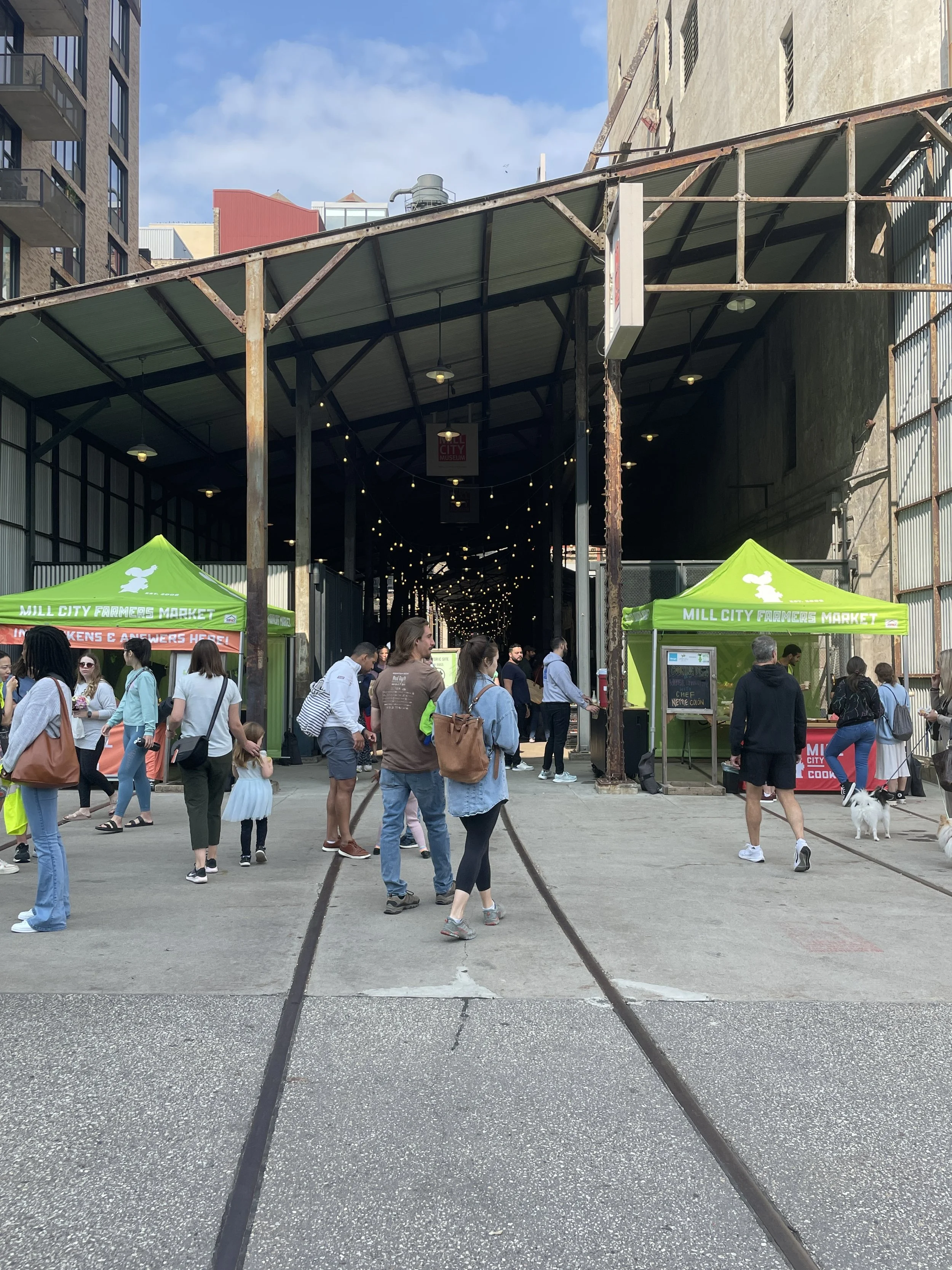
We decided to “step into the shoes of the user,” and attend the Mill City farmers market. We observed attendees, spoke with vendors, and gathered information on areas of the market that could be improved upon while attending.
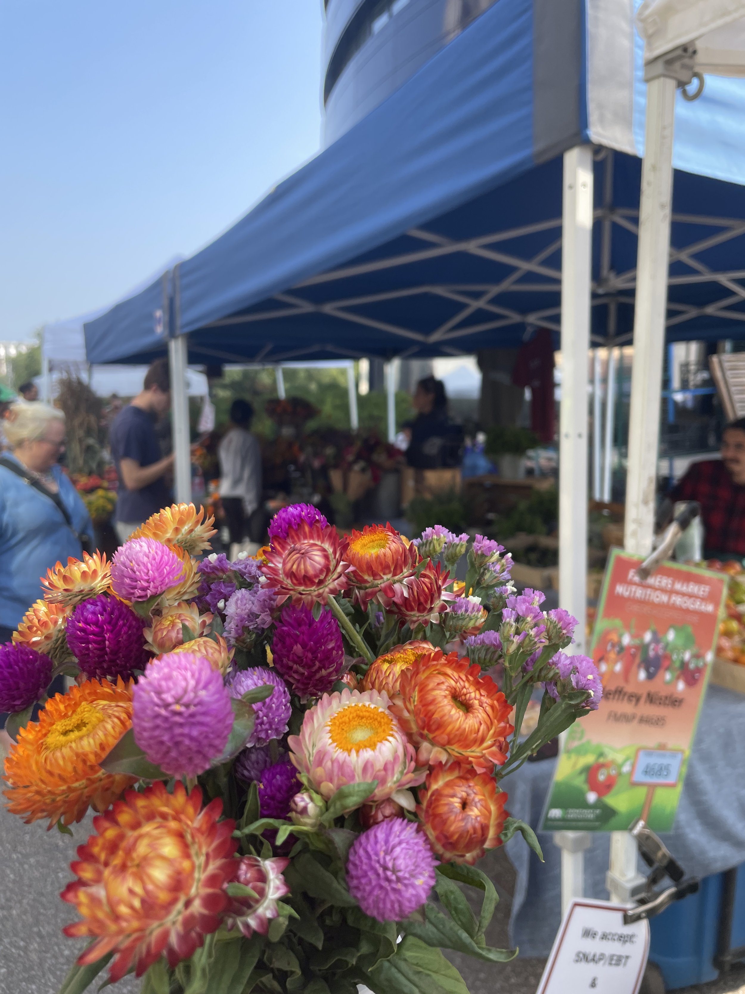
Below are images while at the market.
SERVICE SAFARI


We created an empathy map to highlight what the users need to know, currently do, and currently feel while attending the farmers market. We reflected upon our time at the market and those we spoke with to create the map.
From there, we decided to focus in on some key aspects we would like to pinpoint in our design process.
Empathy Map

THE BIG IDEA
DESIGN a WELCOMING kiosk at the entrance of the market, that INCLUDES helpful and EDUCATIONAL tabs for users to engage with and CREATE A PURPOSEFUL TRIP TO THE MARKET.
2. PROTOTYPE
Persona - FIRST TIME Farmers Market ATTENDEE

“ I want to attend the Mill City Farmers Market but worry about navigation at the market and attending with a small child. “
Amy has recently moved to Minneapolis with her 5 year old daughter and partner. She has heard great reviews about the Mill City Farmers Market and hopes to attend soon. She thrives in being apart of her community and hopes to have a memorable experience while at the market and make it her regular stop.
Background
Shop healthy and affordable produce for her entire family
Support her local community, farmers, and small businesses
Feel like a sense of community and welcomeness while attending the market
Goals
Potentially feeling overwhelmed and lost while at the market
Navigating through stall and locating the specific produce that she wants to purchase
Keeping her child entertained while simultaneously exploring the market
Pain Points
BEFORE JOURNEY MAP WITHOUT KIOSK

AFTER JOURNEY MAP WITh KIOSK

User Decision Tree
The user decision tree highlights the main flows of the user while at the farmers market. The flow pin points the thought process on when and why a user might interact with the informational kiosk.
The user flow helps aid with the creation and flow of the kiosk in understanding why a user does particular actions.

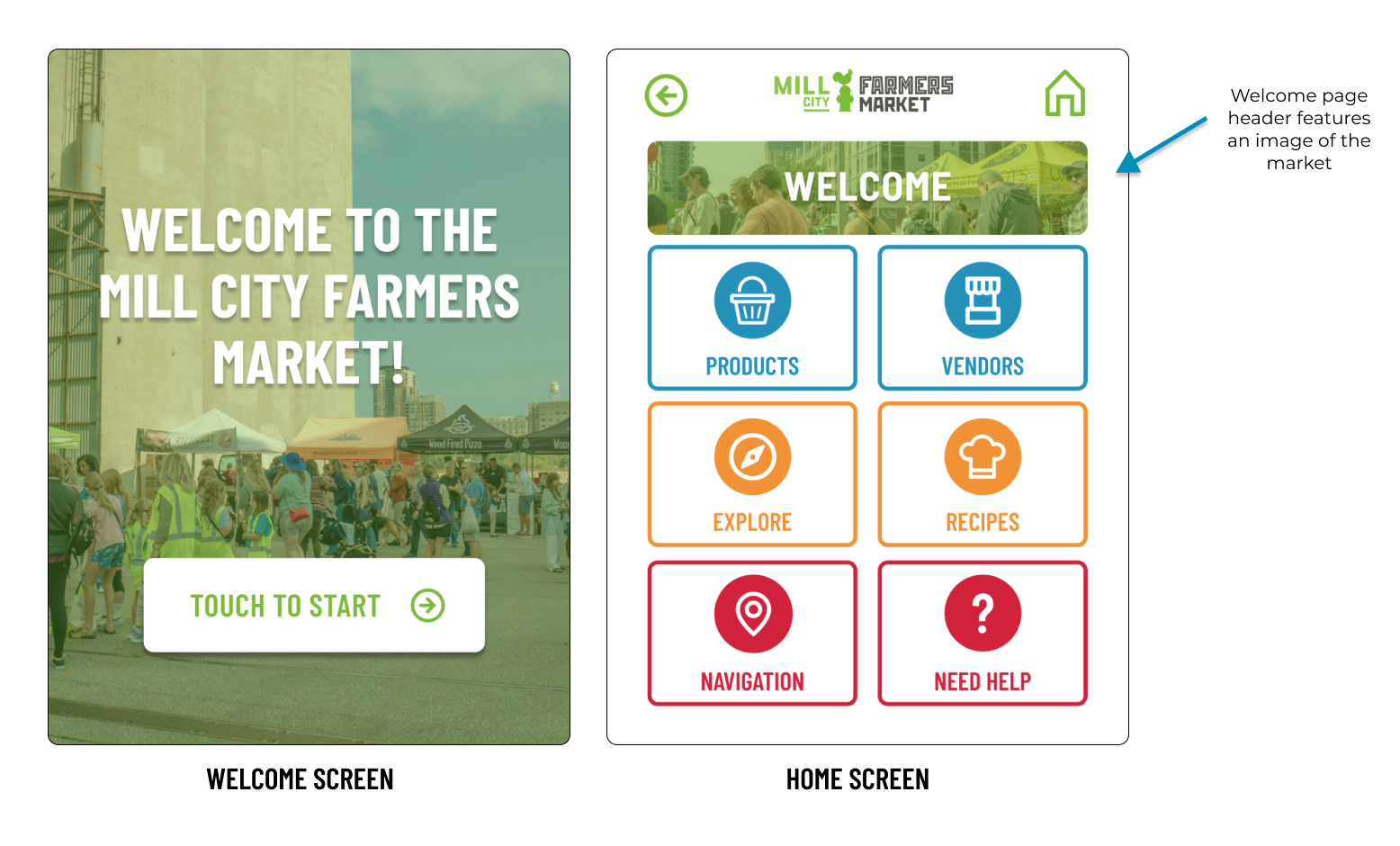
KIOSK Decision Tree
The kiosk decision tree highlights how a user would navigate through the kiosk.
Once bypassing the welcome screen, the user will be able to click through key categories. By clicking on one, a user will be able to discover more areas of interest within the category.
For example, when clicking on the “Explore” button, a user will be prompt to different topics to learn more about including a scavenger hunt and history of the market.
The kiosk flows in a cascading fashion and is inspired by the Mall of America navigational kiosks.

MOodboard
For the moodboard, we wanted to evoke a feeling of welcomeness and colors that would catch a users eye while attending the farmers market.
The moodboard hopes provides a visual idea for how the kiosk would look and feel before digitally prototyping.
Different illustrations of foods and objects typically found at a farmers market offer inspiration for the design style of the kiosk.
Inspiration for the kiosk’s physical style was taken from the Mall of America directional kiosks.

LOW FIDELITY WIREFRAMES


HIGH FIDELITY WIREFRAMES


3. ANALYZE
Usability Testing
To evaluate the kiosk prototype, we conducted an usability study with multiple participants. Participants were asked a series of questions to spark a reaction and provide feedback on the kiosk prototype thus far. Highlighted in the graphic are randomly selected users and their opinions on the kiosk.
Questions asked covered the following topics:
Overall Reaction
Appeal and Value
Long-team Use
Concerns and Drawbacks
Overall User Experience
KEY INSIGHTS

Positives :)
User testing found a positive response to the user interface of the app
80% of users could see themselves or someone they know using the kiosk while at the farmers market
Users generally felt they could easily navigate the kiosk and locate beneficial resources for them
Users appreciated the large buttons to click on and distinct icons on the Home Screen
Users enjoyed the inclusion of the scavenger hunt especially for children
85% of users rated the overall app experience an 8/10 or higher
Negatives :(
Users pointed out they would like to see more images integrated into the design to make the design appear less, “flat”
An user pointed out they felt they wouldn’t engage with the kiosk because they prefer to look at screens as little as possible outside
Users believed it would be helpful to include indicators on whether food sellers or stands were present at that specific market day
Users felt confused on the scale of the kiosk and where they would be specifically located when attending
4. Deliver

Style Guide
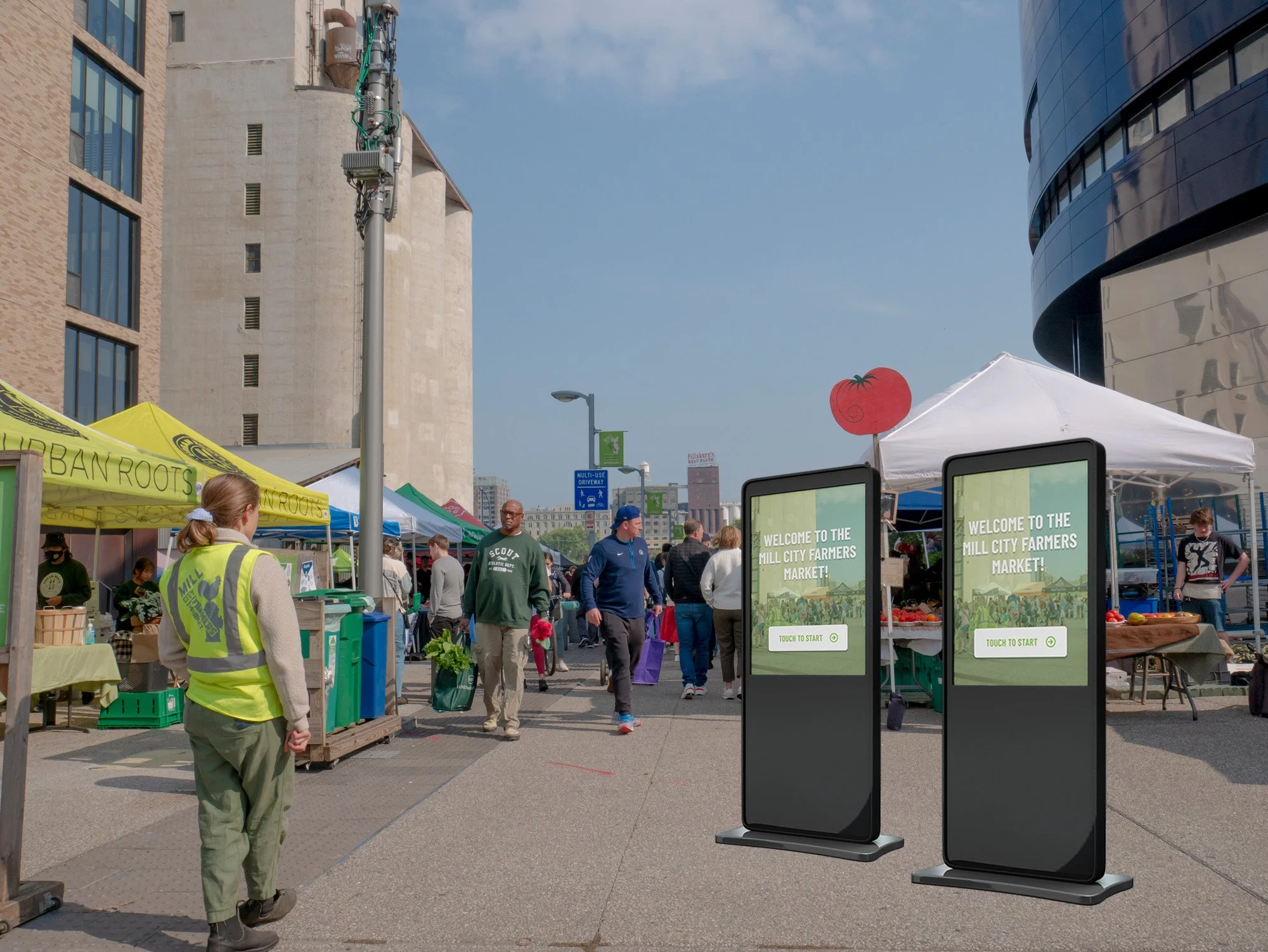
Final Kiosk DESIGN


IMPACT & TAKEAWAY
Based on the research conducted and overwhelming positive responses we received during consumer testing, we believe that this prototype would be beneficial to the farmers market and alleviate initial pain points when attending the Mill City Farmers Market. The kiosk will help welcome visitors to the market and be a beneficial resource to those attending.
Downtown Minneapolis, Minnesota. Mill City Farmers Market. (n.d.). https:// millcityfarmersmarket.org/
Exploring consumer spending at Farmers’ Markets: Who spends more? (n.d.-a). https://digitalcommons.usu.edu/cgi/viewcontent.cgi?article=2035&context=extension_curall
O’Brien, J. (2017, March 28). Celebrating the many benefits of farmers markets. Farmers Market Coalition. http://farmersmarketcoalition.org/celebrating-the-many-benefits-of-farmers-markets/
Spoden, K. (n.d.). Seven reasons to shop at Minnesota Farmers Markets. UMN Extension. https://extension.umn.edu/farmers-markets/seven-reasons-shop-minnesota-farmers-markets
Town’s End Stillhouse & Grill. (2022, July 1). How many Americans use farmers’ markets? TE Stillhouse. https://townsendstillhouse.com/blog/how-many-americans-use-farmers-markets/
Market Resources References